PBS Hawai‘i Program Guide
One major project I wanted to complete in my first year at PBS Hawaiʻi was a redesign of the monthly Program Guide. It had evolved through the recent years from a 24-page, robust directory, to a 12-page magazine/program guide, and it needed some polishing for those changes to fit.
The Program Guide is a combined effort across the station, with most departments represented somewhere in the pages. I met with our vp's and CEO throughout the project to focus on what needed to be changed, and the vision for what the Guide could be.
Visually, I wanted to create more white space, soften some of the sharp edges and high contrast of the previous design, create spaces for the reader to enter the page, and create a more natural, vertical flow. We also wanted to find some ways to localize the Guide. What makes it belong to PBS Hawaiʻi, instead of just PBS?

I researched the process of creating and designing kapa cloth to look for patterns that would point to Hawaiian culture. Eventually, I included a square watermark pattern in homage to the wooden mallets used to beat the cloth into flexible strips, and horizontal arrows inspired by ʻohe kapala to encourage the reader's eye forward.
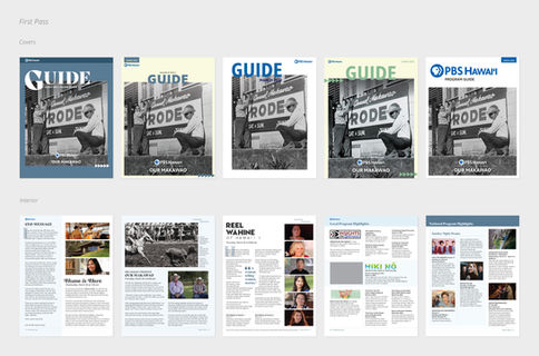
I worked through multiple passes of Guide covers and interiors designs, originally sticking with a blue theme. When this began to feel passive, I explored more colorful approaches.

An example of the final design language of the Guide is below. Some elements, like the grid, daytime programming, and signup sheet, remain pretty consistent with just a bit of a facelift. For now, I'm happy with the flow created and the focus on storytelling we get in the front of the guide, with lots of real estate for compelling imagery, and the flexibility to add engaging accent colors to brighten the page.


